I was so surprised by the results of this experiment that I thought it was worth writing up to share. One simple tweak can bring you THREE times as many email sign ups. Read on…
I recently switched over to ConvertKit, and it’s been a really positive experience so far. But hey, I’m a compulsive tinkerer, and I subscribe to the view that it’s probably easier to get more email subscribers by improving the conversion rate of your existing traffic, than by trying to get more traffic.
So with that in mind, I wanted a quick and easy way to test some simple changes, to see what effect (if any) it would produce.
When I switched to ConvertKit, I was able to ditch my old LeadPages account. I thought LeadPages was too expensive to keep paying for, and simply not worth it.
The first step to improving conversion rates with ConvertKit
To get more control and flexibility of my opt-in forms I implemented [bl id=”4153″]ConvertPro[/bl]. Personally, I think ConvertPro should come bundled with ConvertKit, it’s that good.
Read my post – Power up ConvertKit with ConvertPlug.
Update: Convertplug was later re-named ConvertPlus, and the publishers subsequently released a superior version of this plugin called ConvertPRO. I have amended links in this article to the newer ConvertPro.
A simple A/B test to TREBLE your sign ups
One of the many great things about ConvertPlug is that it gives you the ability to do A/B split testing. If you’re not familiar, this means you can create a clone of your form, then change something to see if it improves the effectiveness. The system then shows form A to half of your visitors and form B to the other half. Over time, you can see if the stats show any difference.
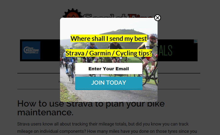
This was my starting point, a very simple pop up form that appeared across the whole site.
It’s literally the very first form I threw together to replace the generic form I’d been using via SumoMe (which I also ditched when I switched to ConvertKit).
Whilst dabbling with the settings, I noticed an option – a single tick box – to make the pop up full screen, so I thought this might make a good A/B test.
It only took a couple of minutes, literally, to set up the variant option for the A/B test, which then looked like this:

So with my two variants in place, I started the test. Form A was the original pop up, and Form B was almost identical, but a full screen version.
It’s often tempting to conclude the results of tests like this after just a few days. But fluctuations can occur and ideally you need to let it run for longer.
I ran my test for a whole month.
The more data you can collect, the more robust your data sample, and the more confident you can feel that your results are real, and worthy of informing your decisions about how you present your forms in future.
So let’s look at the data.
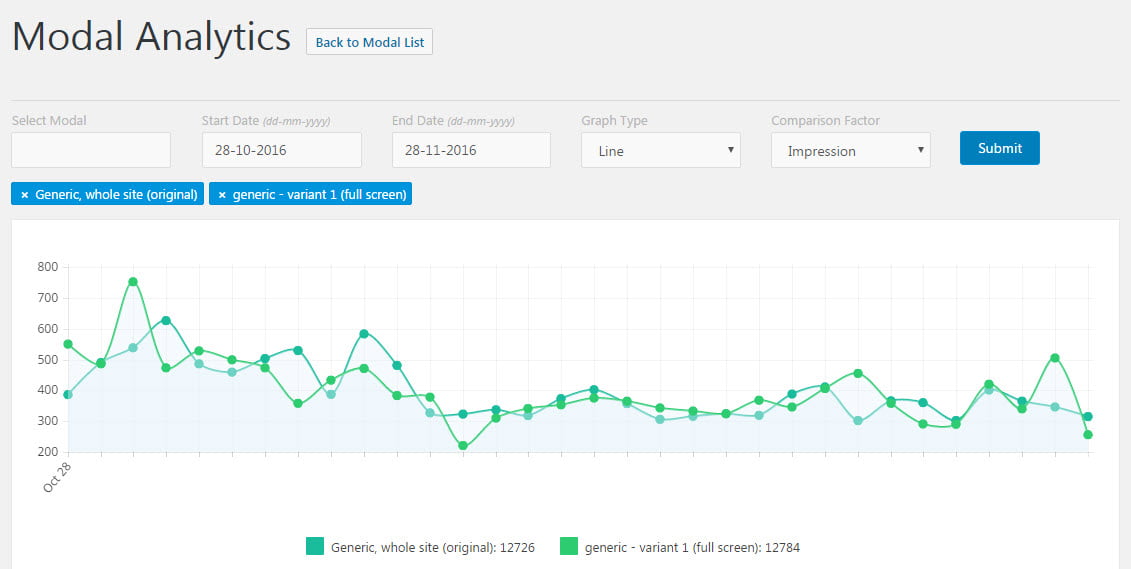
Over the course of the month, you can see that overall, the number of impressions was almost identical. The original form was shown 12726 times, with the full screen variant being shown 12784 times.
[bl id=”4153″]ConvertPro[/bl] makes it really easy to query the data, and you can easily change the date range, or the type of chart, or indeed switch to view the data for a different form, with just a couple of clicks. Here’s the same data in BAR chart form, which I think is more suitable for an A/B test report.

It’s plain to see that on most days, both forms of the pop up were shown more or less an equal number of times, and that overall, the total impression count for each was remarkably similar, with Form A (original) being shown 49.88% of the time, and the full screen variant, Form B being shown 50.12% of the time. That’s close enough for me.
So the big question would be whether we would see any difference in the number of people actually signing up via the forms. Would the simple change in design – making the form full screen – have any effect at all?
How did the forms convert?
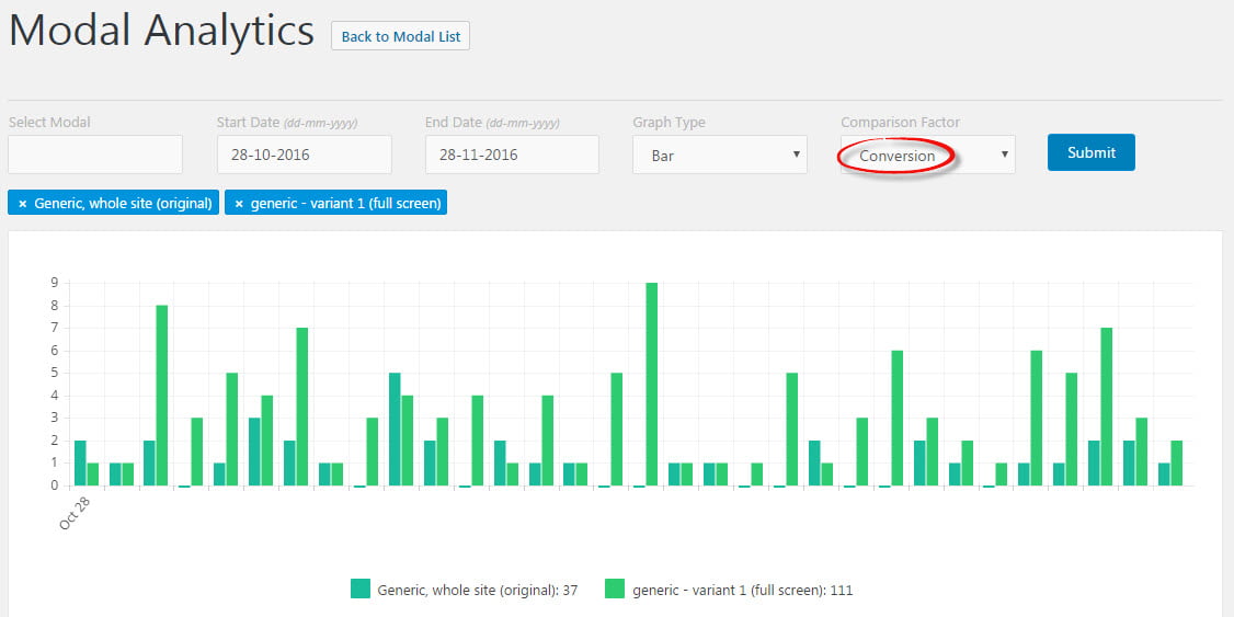
It’s quite clear from the chart that the light green bars (representing the full screen version) are significantly higher than the darker green bars (original form). The numbers in the summary give it away. My original form gained 37 sign-ups, whereas the full screen variant attracted 111. That’s a very significant difference.
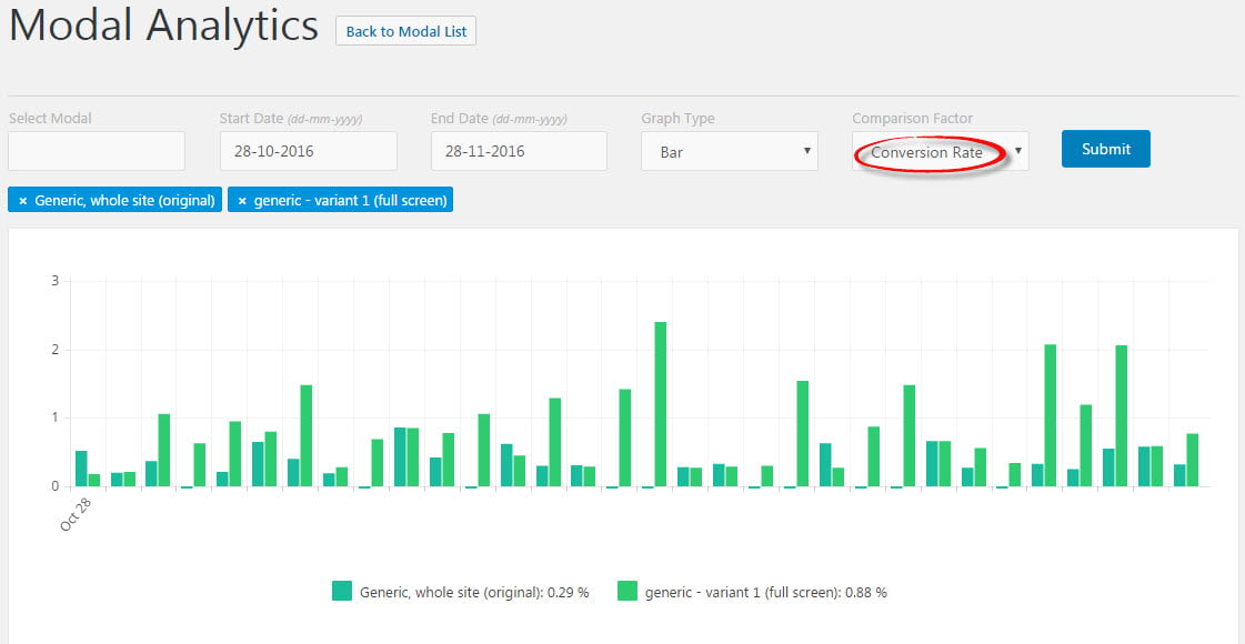
When we look at the conversion RATE, we see that the original pop up got 0.29% of people to sign up, whereas the full screen version achieved 0.88%.
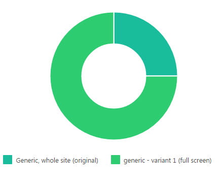
When you look at the data in donut form, you can see that we got three subscribers with the full screen form for every one via the original form. That’s an impressive result, with a very clear and obviousl winner.
To calculate whether the difference is statistically significant, there are various online calculator tools you can use. Because most split tests won’t produce results as clear as this one.
But to demonstrate, I used the one over at www.splittestcalculator.com and it produced this result.

With my data, gathered over a whole month, and involving over 25K impressions, we can be completely confident that my full screen version of the pop up is more effective.
So if you’re using regular sized pop ups, you might just want to experiment with some full screen versions on your own site!
Fortunately, with ConvertPlug, that’s super simple.
Nice work! A/B testing is key for everything we online entrepreneurs do 🙂
Fab post Alan thanks for sharing your test. I have ConvertKit and ConvertPlug but have not tried this. But in reading your results I’ll definitely be giving it a go. It’s actually made me think, the full screen looks more professional and clean less spammy and annoying!!!!
Me too, it’s cleaner. I think that’s why it works so well – there are fewer visual distractions for the visitor on a full screen pop up where the only option is to sign up or close.
Thanks for the article Alan! Just bought Convertplug! Just a quick question: how do you make the link above for Convertplug go from http://www.darkstardigital.co.uk/convertplug go to Code Canyon when clicked? Thanks!
Thanks Edmond, I use a link shortening plugin called BetterLinks, but there’s also a more pupular one called PrettyLink. Very handy for making nice, logical URLs that are easy to remember. The plugins also track the hits to each one too, so you can see which are getting more attention.
Thanks very much for this Alan!