I recently shared some findings regarding a simple tweak I made to a pop up form, that yielded massive results.
To summarise: I created a full screen version of my simple pop up form, and it massively outperformed my original pop up in an A/B test over a one month period.
Interestingly, someone on a Facebook discussion thread asked if there was any difference between the confirmation rates of each form. Their theory was that the full screen version might appear like more of a barrier, and some people were signing up simply to get past the page and get back to the site content.
After people sign up, they get an email with a link to confirm that they want to be on the list.
For that initial test, both of the convertplug forms were linked to the same convertkit form, so I could not tell if one version of the pop up was more effective than the other at leading to people confirming their opt in.
The commenter’s hypothesis was that the full screen version would lead to fewer confirmations, as many of them never really wanted to sign up in the first place.
It seemed like a very good point, and I needed to gather more data.
Testing the hypothesis.
I set up a new duplicate form in ConvertKit, so that each variant of the popup form was linked to its own CK form. This would let me track the signups via the pop ups on site, AND the confirmations from each source, separately.
I ran this configuration for a whole month (December 2016), and here are the results.
Keen observers may notice a slight decline in figures from the previous test data. This is because the site is quite seasonal and the traffic always dips over the winter.
Impressions
Impressions, or put more simply, how many times each form was shown to a visitor, are important to establish because we need to feel confident that each version of the form was shown roughly an equal number of times.
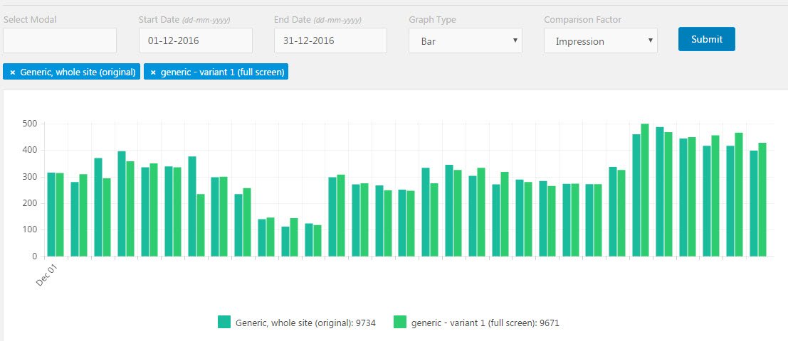 We can see from the data that my original pop up was shown 9734 times, and the full screen variant was shown 9671 times. That’s close enough for me. By the way, I was running this A/B test (and the pop ups themselves) using [bl id=”2378″]ConvertPlug[/bl]. (But I would now recommend the newer version – [bl id=”4153″]ConvertPRO[/bl]
Sign ups
This data shows how effective each pop up was at getting people to input their email address and click the submit button.
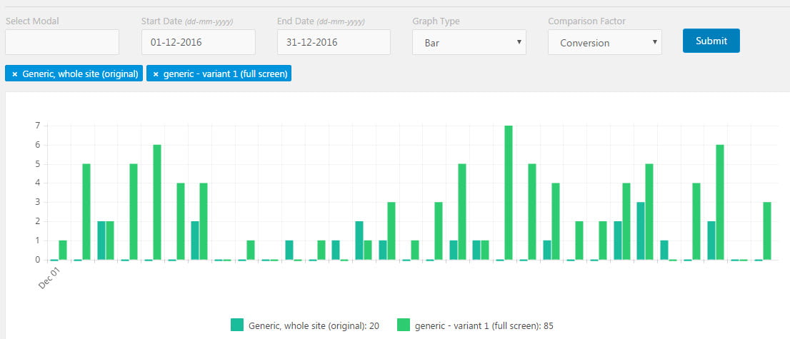
We can see quite clearly that, just like in my previous post (for the prior month), the full screen option is the clear winner. The original pop up got 20 sign ups, and the full screen variant got 85!
These results are consistent with my previous test. In fact, the full screen version attracted an even higher percentage this time, 80% (85 out of a total of 105), whereas in the first test it was 75% (111 out of a total of 148).
But here’s the crucial question.
Were the folks who signed up via the full screen form less likely to confirm their email, by not responding to the confirmation email?
Here are the number of confirmations from each, for the month, obtained by doing a manual count of the confirmations to the separate CK forms.
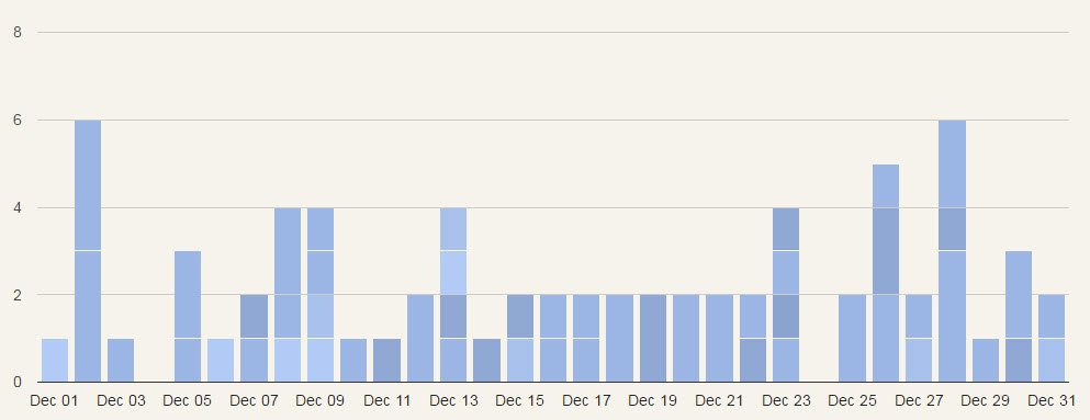
The original pop up led to 12 confirmations. The full screen variant led to 26 confirmations.
What percentage of the sign-ups actually confirmed?
The original form had 12 confirmations out of 20 opt ins. That’s 60%
The full screen version had 26 confirmations out of 85 opt ins. That’s only 30%
Conclusions
From this additional data, we can now say two things:
- A full screen pop up will attract significantly more sign ups to your mailing list, but
- The conversion rate for the full screen version will be lower.
In my case, the numbers still stacked up in favour of the full screen version, with more than twice as many confirmed opt ins than the original variant. So in my case, it’s still a no-brainer to implement the full screen version. Your audience may vary, so as always, test, test, test!
But doesn’t the new Google popup penaliser update make all this redundant?
Only for popups that fire automatically.
If you have opt in forms that appear in response to a user action, such as clicking something to find out more, you’re all good.
Plus, at the time of writing, you can still have automatic popups on desktop. It’s only penalised on mobile at this stage. But most people seem to agree that it’s only a matter of time before it becomes a blanket policy for all sites. So the golden rule going forward seems to be – don’t thrust content in front of people if they didn’t ask for it.
Please share this article if you found it useful!
Leave a Reply